Did you know that more than 96% of all websites are not accessible to users with disabilities? As food bloggers, it’s so important that we make our websites and recipes accessible and that we share content that everyone, including those with disabilities, can enjoy.
Who benefits from website accessibility? LOTS of your readers! One in four U.S. adults in the U.S. live with a disability, and making your site more user-friendly benefits everyone, including:
- People with visual impairments who may require a screen reader
- People with limited hand motor skills, arthritis, or other mobility issues that make using a keyboard or mouse difficult
- People with color blindness
- Non-English speakers who use translation services
- People with epilepsy who might be triggered by a bright screen, motion, or flashing images
- Older readers (did you know that the average person’s ability to use a website declines by about 1% every year after the age of 25?)
It might feel overwhelming when you first dive into creating an accessible website. The Web Content Accessibility Guidelines (WCAG) may seem lengthy and complicated, but we’re here to help you understand them!
While it is very difficult to achieve 100% conformance with the WCAG guidelines, you should view this as an ongoing process of improving your content to be as accessible as possible. Baby steps! So, let’s get started.
We’ve rounded up three simple ways that you can make your food blog more ADA compliant today:
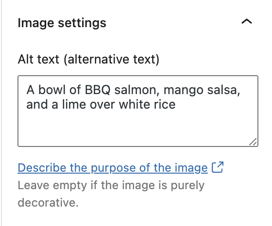
1. Write descriptive and meaningful alternative text for your images
Alt Text Quick Tips:
- Limit your alt text for each image to between 100-125 characters.
- When brainstorming alt text, think: “What would someone who can’t see this image need, or want, to know if they’re using a screen reader?”
- If an image has a text overlay, be sure to include that text in your alt text description, too!
- Do not include the words “photo” or “picture” or “image” in your alt text – they’re redundant and won’t improve your SEO or make your site more accessible.
- For a button or link image, alt text should describe the purpose of the link.
- If an image is purely decorative, the alt text should be empty.
- Avoid hashtags and keyword stuffing.
For more information on alt text, check out the FBP Quick Win on Understanding the Alt Attribute and our blog post on The IMG Tag and How it Can Super Power Your Food Blog.
2. Use the headings in your blog posts to convey structure and meaning
Headings (like H1s and H2s) aren’t just for the design, or look, of your blog posts. They serve a purpose for SEO and also improve the accessibility of a website.
People who use screen readers often scan web pages by skipping from heading to heading. Because of this, headings should serve as an outline for your blog post.
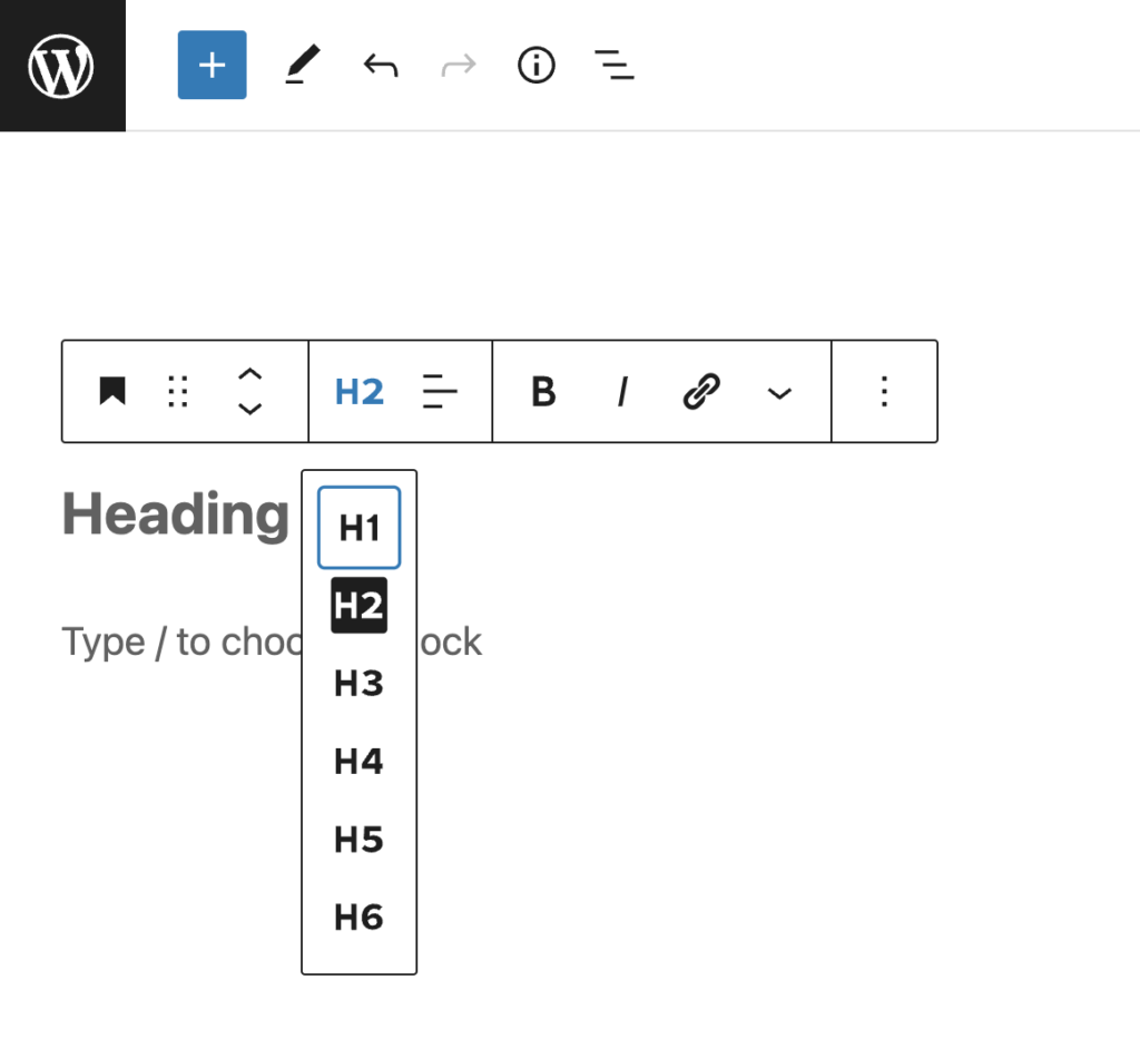
Headings should always be nested by their level, or rank, to help users navigate the page. This means that your H1 heading is the most important, and the H6 heading is the least important.
You should only use one H1 per page (and it should be your post title), and the order of headings should descend based on the depth of the content (i.e. you should never have a H5 heading before a H3 heading). Last but not least, don’t skip headings (don’t jump from a H2 to a H4).
3. Rethink your Links
We all know how important it is for your blog posts to include internal and external links for SEO purposes, but the formatting and link text is just as important for accessibility!
First off, links on your page should be indicated by something other than a color change. The most common and easily recognized way to indicate that text is a link is to underline it.
Here is an example of what links look like on Pinch of Yum:
In addition to these visual changes, links are most useful when they make sense to a reader even out of context. Avoid using phrases like “click here, “read more,” or “here” as your link text. Instead, the link phrase should convey the purpose of the link.
Bonus: Add an Accessibility Policy to your website
Now that you’ve improved your website’s accessibility with these tips, it is a great idea to add an Accessibility Statement to the footer of your food blog. Why? An Accessibility Statement will demonstrate to your readers that you prioritize accessibility and social responsibility. It will also provide your users with information about the accessibility of your content and ask for feedback, when needed.
What should you include in your Accessibility Statement?
- A commitment to accessibility for people with disabilities
- The accessibility standard you used on your website (this site provides a handy check-list)
- Your contact information, in case a user encounters an accessibility issue on your site
- Any steps or measures you’ve taken to improve the accessibility of your website
This tool can help you generate an Accessibility Statement for your blog, and this website provides an example.
Want more information on creating an accessible website? Check out this podcast episode to learn more!
Now it’s your turn! Have you made any updates to your websites to make them more accessible? If you have, how did it go?
I used that tool to generate an accessibility statement. Can you give me an example on how to add it in the mission statement or somewhere else? I don’t see that POY has a mission statement, so what would be the best way of adding it. For example when I downloaded from the tool, here is one sentence and I want to meet it:
Include accessibility as part of our mission statement
Also one more,
Assign clear accessibility goals and responsibilities. – How do I conform to this sentence?
Hey, Ali! We’re so glad to hear you tried out the tool.
Here’s a great example of what an accessibility statement looks like: https://bhmbizsites.com/accessibility-statement/
I think that would be a great place to write your accessibility goals and responsibilities. You could also consider mentioning your accessibility goals on the About page of your website since that might already be a place that showcases your mission statement.
I hope that helps!
Thanks!
Thank you for providing such well-written content on your website, kudos.
So glad you enjoyed this post!